Update: There is a revised and corrected version of the model and spreadsheet here, with discussion.
In a recent post I built a model with one rich person and ten poorer people to ask: does redistribution from rich to poor make us all more wealthy? The conclusion was Yes. Jump back there to see a quick rundown of the model’s assumptions.
Michael Sankowski at Monetary Realism put the model through its paces, and provide feedback by email. He pointed out one very interesting thing: total wealth accumulation in the model increases (faster) with redistribution in both directions — from rich to poor and poor to rich.
(Note that redistribution could take infinite forms — traditional welfare, education and health-care spending, tax preferences for rich people’s investment income, corporate subsidies, etc. This is systemic redistribution we’re talking about here. Like this model, the system just does it.)
Here’s what that looks like, with starting wealth of $2 million, divided 50/50 between the rich person and the ten poorer people. (click for larger):
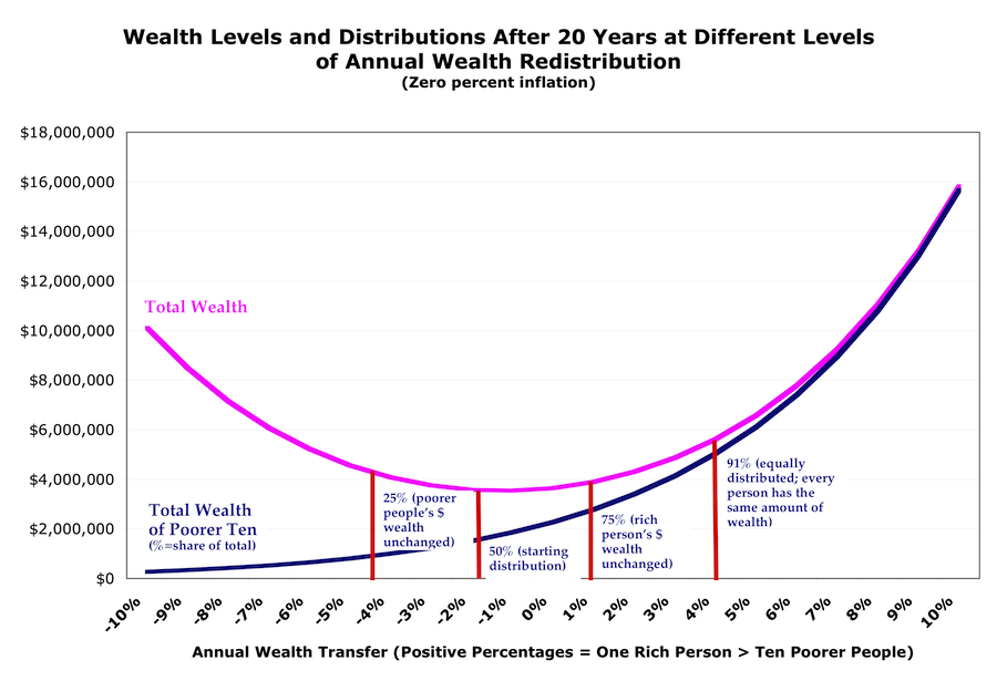
(Since income in this model is based on spending from wealth, the income curves look similar to these wealth curves.)
It sure looks like giving more money to rich people does make the pie bigger — just not as fast or as much as giving more money to poorer people.
Since the model is based on the idea that poorer people spend more of their wealth each year, so giving them more money increases money velocity hence GDP and eventually wealth, this seems weird. But here’s the explanation: there’s a zero lower bound on poor people’s spending. It can only decrease so far, and so fast. Rich people’s spending can keep increasing with no constraints.
So as you transfer more wealth from poor to rich, the poorer people’s spending doesn’t decline as fast as the rich person’s spending increases — even though the poorer people spend a far larger proportion of their wealth than the rich (here, 80% vs. 30%). The zero-bound effect overwhelms the velocity effect.
Except. There’s a flaw in the model: as I’ve said, it assumes no behavioral responses — only that production (and the surplus from production) are driven by spending, with that whole process relegated to a black box. More spending yields more production and more surplus, with those received as income proportionally to each person’s spending. And spending is based on wealth.
But at the left side of the curve, where the rich person starts getting all the income, doing all the spending, and holding all the wealth, the poorer people have no incentive to work. (Their time is much better spent storming the castle with torches and pitchforks.)
If the poorer people have no incentive to work, there are no goods for the rich person to buy. Spending, income, and wealth would all go negative. So you would inevitably expect the left end of the income and wealth curves (like the peasants) to bend over and di(v)e eventually.
But for quite a ways along the left side of the graph, we’re not at that point. People have plenty of incentive, actually increasing incentive, until they actually are starving: they need to keep their families from starving, get health care for their kids, keep a house over their heads. So the bulk of the graph does yield lessons.
Here’s the most interesting one, to me: the smallest wealth accumulation in this model occurs at the point that maintains the status-quo wealth distribution. (Where there’s a 1.4% annual wealth transfer from poor to rich.) Everybody stays the same relative to each other, and the pie does get bigger (there’s a 5% surplus every year!). But it ends up being a smaller pie than with any other redistribution scheme.
Another lesson here: trickle-down actually works! Compared to zero redistribution, transferring 1.4-4% of poorer people’s wealth to the rich person results in everyone getting wealthier (again, compared to no redistribution), including the poorer people. Move to the left of that, though, and the poorer people get poorer while the the rich person gets richer.
And everyone, poor and rich alike, gets wealthier faster if you redistribute in the other direction — from rich to poor. Compare:
| Ending wealth in millions after 20 years if you transfer 1.5% of wealth annually (starting wealth $2 million divided 50/50): | |||
| Rich One | Poorer Ten | Total | |
| Rich to poor: | $1.0 | $3.1 | $4.1 |
| Poor to rich: | $1.8 | $1.7 | $3.5 |
Remember that this model assumes no inflation, so in the top line the rich person’s real wealth is unchanged.
Note that these redistribution percentages are just illustrative. They’re nothing like policy proposals. The turning points and break points all depend on what parameters you plug into the model. But the shape of the curve, and the concepts that emerge, remain unchanged.
Finally, note this: If we redistribute enough (rich to poor) to actually reduce rich people’s dollar wealth, the pie gets much bigger, much faster.
And if you add the notion of declining marginal utility of spending and consumption, the aggregate utility pie gets even bigger, even faster.
Cross-posted at Angry Bear.
Comments
8 responses to “Wealth and Redistribution Revisited: Does Enriching the Rich Actually Make Us All Richer?”
[…] my model here and here looking at how (re)distribution of wealth affects demand, hence production, […]
[…] can see a simple arithmetic model of this thinking here and here, and download the spreadsheet to play with it […]
[…] arithmetic of this is straightforward and inexorable. Extreme inequality and upward redistribution kills […]
[…] arithmetic of this is straightforward and inexorable. Extreme inequality and upward redistribution kills […]
I stumbled upon your blog via a comment you made at monetaryrealism, and then stumbled onto this post. As an engineer (chemical), I frequently use “toy” models similar (in spirit) to this one to investigate ideas.
I downloaded your spreadsheet and played around with it a bit, and have a technical question/criticism:
Shouldn’t the transfer payments balance? That is, the amount transferred from the rich ought to be equal to the amount transferred to the poor, yes?
FWIW, I altered the model to reflect this. The plot of total wealth after 20 years vs. % transferred looks different… In fact, it shows that total wealth (rich + poor) increases monotonically with increasing transfer percentage. Here is a plot:
http://i.imgur.com/ReWX1vo.jpg
I’d be happy to share my version with you, of course.
@JGF
Without jumping into the spreadsheet or thinking very hard at all: I’m guessing the answer is no: it’s built so that there’s a 5% surplus on what’s spent each year. So wealth should grow exponentially.
But there could certainly be an error. Should I dive in? And thanks for looking.
@Asymptosis
I think the 5% surplus is a different issue. I don’t really see anything wrong with that.
If I interpreted the spreadsheet (and the explanation) correctly, the model assumes:
1. Annually, the rich spend 30% of their wealth, the poor spend 80% of theirs.
2. Annual income is 5% larger than annual spending for both rich and poor.
3. There is an annual wealth transfer.
I would have thought that the annual wealth transfer part should have consistent accounting. That is, the wealth transferred *from* the rich would equal the wealth transferred *to* the poor.
But in your model, the wealth transfer is a function of the particular cohort’s wealth, and so the transfers do not have to balance. Let’s look at a simple case where there is no spending (and so no income). And let’s say there is a +10% wealth transfer. If the Rich have $2 and the Poor have $1, your model would say that at the end of the year, the “transfer” would take 10% * $2 = $0.20 from Rich (leaving him with $1.80), while the transfer operation would give 10% * $1 = $0.10 to Poor (leaving him with $1.10). The transfer results in a net decrease in wealth, which doesn’t seem realistic to me. Though I suppose you could say that the government is keeping the surplus, which would probably make Paul Ryan happy. 😉
I think it would be better to have the transfers balance. So if there is $0.20 transferred *from* the Rich, then $0.20 is transferred *to* the Poor.
Sorry for the wordiness of the comment.
[…] Update: More expansive discussion of this model with more graphics, here. […]