Not because it shows us how bad things are.
Because it shows us how little we know about how good or bad things are.
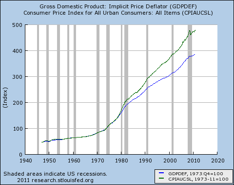
What’s a 1975 dollar worth today?
Either $3.40 or $4.21, depending on who you ask. That’s a 24% difference.
Every inflation-adjusted analysis you see depends on one of these price deflators, or one like them.
The lessons here:
• Whenever possible, try to draw your judgments based on analysis of nominal dollars, not real dollars. Ratios help here — Measurement X / GDP, for instance, instead of “Real” Measurement X.
• When you’re looking at analyses, watch out for ones that use multiple, different deflators. The NIPA tables have different deflators for different things, for fairly good reasons. But not every analyst is anything like as diligent in their efforts (flawed as they may be) as the NIPA compilers.
Prices and Plutocrats – NYTimes.com.
Comments
3 responses to “The Most Depressing Graph I’ve Seen in a While”
I’ve been steadily losing faith that macroeconomists have any idea what they’re doing. They’re an awfully confident group for such poor data.
Actually, Chris, I think the whole edifice is a house of cards.
Seriously,
JzB
I agree that you should be aware of which deflator is being used. But to work only with nominal dollars would be a big mistake, especially in times of high inflation. GDP growth would be misrepresented by a substantial amount if you only used nominal dollars.
According to my macro text, the indices serve different purposes and should be used in context. Just as inflation differs among individuals depending on their personal market baskets, inflation is different for capital-intensive businesses vs. individuals. The GDP deflator measures both investment and consumption goods. It can be thought of as a combination of the PPI and the CPI.
I wouldn’t knock the CPI-U as a measure of inflation. The methodology used to compile it is quite rigorous and comprehensive. You just have to understand that it’s an average, and like all averages, it hides an immense amount of variation.