Cross-posted at Angry Bear.
Thanks to yeoman’s work by Larry Bartels, Mike Kimel, and a host of others, we’ve seen that over many decades, the American economy has performed far better, by almost any measure, under Democratic presidents.
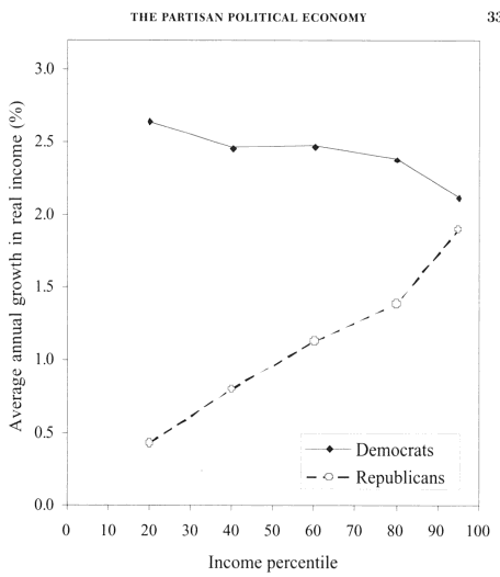
Larry Bartels’ key graph mapping income growth by quintile, 1948–2005 (from page 33 of Unequal Democracy) is perhaps the best demonstration of that. Even the rich get richer, faster, under Democratic presidents. The poor and the middle class get far richer:
All those findings came as a surprise to me when I first saw the data. I’d pretty much accepted the Republican “party of growth” party line, after hearing it repeated thousands of times over several decades. It turns out that at least for American presidents, it just isn’t true. Not even close.
Even though the data’s been sliced, diced, and analyzed every which way from Sunday, with consistent results, critics still try to second-guess it. Many or most of these objections are spurious — statistically illiterate, logically flawed, or just plain self-contradictory special pleading.
But at least one repeated question does bear examination: What about Congress? Don’t they supposedly control the purse-strings?
Here are some questions — some of which may seem to have “obvious” answers, though we really can’t know until we look systematically:
1. Do Democrats and Republicans in the different branches deliver systematically different results in spending, revenues, and deficits (and more tenuously, second-order effects like real GDP per capita)?
2. What are those party differences? Are they large differences?
3. Do those difference themselves differ depending on whether the parties are in control of the Senate, the House, and/or the Presidency? IOW, do Dems/Pubs act differently in the House than they do in the Senate or the presidency?
4. Which branches have the greatest effects on different economic measures?
5. In which branches do Democratic and Republican results differ the most? Does that vary depending on the economic measure you’re looking at?
6. Do certain party combinations in the Senate/House/Presidency show systematically different results in spending, revenues, etc.? Is there any sign of an optimal or dystopic combination?
7. Do there seem to be systematic differences between mixed and monolithic control of the branches?
8. Directly addressing the objections mentioned above: does an analysis of congressional results undercut, disprove, or otherwise alter the conclusions from the research on presidential outcomes linked above?
To look into these questions I built a spreadsheet for the years 1961–2009, based on one built by my friend Steve, who tagged all the years for which party controlled each branch. (Thanks, Steve!) The spreadsheet (with data sources cited) is here.*
I chose to start in ’61 not only because the period basically spans my sentient life (self-serving bias?), but because 1. it’s a reasonably long period (49 years), and 2. by then the wild economic swings following the Depression and World War II had settled down. If anyone wants to extend the period backward, it’s an easy matter to add the data from the sources cited in the spreadsheet.
You can jump down to the resulting graphs, or even the summary, but some discussion is in order first.
Details
The central issue here: there are many different ways to look at this data. I’ve chosen ones that I think will give the most inclusive, comprehensive, and comprehensible insights into the questions above, revealing both the big picture and the sometimes messy, contradictory, and ambiguous results. Given the nature of the data, it simply can’t answer some of the questions above.
I detail my choices here. I encourage others to use the spreadsheet to create different views — hopefully widely representative ones, eschewing intentional (or even unconscious) cherry-picking. My choices were driven by just plain curiosity about the “facts on the ground.” I had some notions of what I might find (Dems tax and spend? Pubs borrow and spend?), but given how wrong I was on presidents and economic growth, I wanted to see the numbers. I encourage others to operate from similar principles.
For each year, I entered the change in spending, revenues, debt, and real GDP per capita. Then I built “lags,” so we can look at results in ensuing years. (This assuming that it takes some time to implement then see the effects of policy changes; it doesn’t happen instantly.)
Here’s the upper left corner of the spreadsheet. The “change” percentages are from a simple calc: (year2-year1)/year1.
| CHANGES IN: | ||||||||||
| SPENDING AS % OF GDP | ||||||||||
| year | senate | house | president | dominant | congress | Mix | spend0 | spend1 | spend2 | spend3 |
| 1961 | D | D | D | D | DD | DDD | 1.51% | -1.31% | -0.23% | -0.21% |
| 1962 | D | D | D | D | DD | DDD | -1.31% | -0.23% | -0.21% | -1.54% |
| 1963 | D | D | D | D | DD | DDD | -0.23% | -0.21% | -1.54% | 0.49% |
| 1964 | D | D | D | D | DD | DDD | -0.21% | -1.54% | 0.49% | 2.35% |
| 1965 | D | D | D | D | DD | DDD | -1.54% | 0.49% | 2.35% | 0.67% |
| 1966 | D | D | D | D | DD | DDD | 0.49% | 2.35% | 0.67% | -0.39% |
| 1967 | D | D | D | D | DD | DDD | 2.35% | 0.67% | -0.39% | 0.92% |
| 1968 | D | D | D | D | DD | DDD | 0.67% | -0.39% | 0.92% | 0.49% |
| 1969 | D | D | R | D | DD | DDR | -0.39% | 0.92% | 0.49% | -0.13% |
| 1970 | D | D | R | D | DD | DDR | 0.92% | 0.49% | -0.13% | -1.58% |
| 1971 | D | D | R | D | DD | DDR | 0.49% | -0.13% | -1.58% | 0.45% |
As an example of lagging, the “spend1” data is simply shifted up one year, meaning that the parties controlling the Senate, House, and Presidency get “credit” (or blame) for changes that happen a year later. Ditto for the two-, three-, and four-year lags.
Note that lagging by an additional year means there’s one less year (at the end) to evaluate. We can’t look at a three-year lag for 2008, for instance, because 2011 hasn’t happened yet. Since we’re averaging over a 49-year period, it’s to be hoped that loss of those later years will not corrupt the results excessively. (This gets more problematic when you start slicing up the data; more on that below.)
Since I don’t use any of the zero-year-lag results (I think for obvious reasons, mentioned above, which necessitate the use of lags in the first place), the graphs below don’t tell us anything about Obama’s results in 2009. Previous years’ regimes are analyzed based on the economic changes in 2009, but we have no lagging data on ensuing economic changes with which to analyze 2009. (If anyone wants to add projected data for 2010 and beyond, feel free. Just be sure to tell your readers.)
Yes, this means that the Pub presidents get blamed for 2009, but so does the Democratic congress in ’07 and ’08. Carter gets blamed for some rocky years under Reagan in ’81 and ’82. And etc., throughout the table. This is why we need to look at multiple lags and many years; it serves to average out all the allocations that might seem “unfair” in the particular.
Another method would look at the total (summed or averaged) changes over one-, two-, three-, and four-year ensuing periods. As you’ll see in the graphs below, I chose to summarize similarly by averaging the multiple lag results. I encourage others to try the other methods. I can only display so many graphs here.
As I mentioned above, the analysis gets problematic quite quickly when you start slicing the data into smaller pieces. Our short, 49-year sample quickly rears its head.
Smaller, shorter slices, for instance, might only reflect where they happen to land in the business cycle. And slices concentrated at the beginning or end of the period might be distorted by long, secular trends (geopolitical, cultural, technological) that have nothing to do with party control — Matthew Arnold’s “ebb and flow of human misery.”
Here’s the number of years since ’61 for different regime combinations (Senate/House/President):
| RRD | 6 |
| RDR | 6 |
| RRR | 6 |
| DDD | 15 |
| DDR | 16 |
A comparison of DDD to DDR looks like the most promising in this set of slices because they’re both lengthy and scattered through the 49-year period. Since the only difference is in presidential control, that comparison may have special applicability to the presidency question that launched this investigation, #8.
The smaller slices will be much more subject to business cycles and secular trends. For instance, we’ve got three six-year, single-president slices. RDR is a single span from ’81–’86, when Volcker and Reagan, with a mixed Congress, were trying to pull us out of the biggest recession since World War II (and succeeding) and a 40-year cold war (eventually succeeding). It seems foolish to draw any grand, sweeping conclusions from that single and arguably anomalous slice.
Likewise: RRD is 1995 to 2000 (Clinton), and RRR is 2001 to 2006 (Bush II) — the first a massive boom (bubble?), the other a recession and tepid recovery. Hard to make useful comparisons.
DDD and DDR, by comparison, reflect sixteen- and fifteen-year slices scattered from the beginning to the end of the period.
Anyone can feel free to write narratives based on comparing all these slices. I’ve presented them in the graphs below. But with the exception of DDD and DDR comparisons, I would suggest that those spins will be statistically spurious. You’re just telling stories about single presidencies, which is exactly what we’re trying to overcome here.
Here are the Senate/House combos:
| DD | 31 |
| RD | 6 |
| RR | 12 |
In those 49 years we’ve never had a Democratic Senate and Republican House. And in only six years have we had mixed Congressional control (those six Reagan years). These two facts, especially combined, make it largely impossible to throw any real light on question #7 (mixed versus monolithic control) with this analysis.
DD is a large and scattered sample with both R and D presidents. RR is a single span late in the period — 1995–2006 — so it’s more subject to distortion by longer-term trends, but it’s half under Clinton, half under Bush II. RR and DD comparisons might yield insights.
Larry Bartels ran into these same difficulties when trying to add the effects of the legislature to his regressions. He uses different phrasing in his explanation, which I’ll let you peruse in a footnote.*
If you’re so inclined, you can also slice the data in the spreadsheet by the “dominant” party — the one controlling two out of three branches. I didn’t find much of interest there, but go to town. Again, I can only display so many graphs without it all becoming meaningless spaghetti.
The Graphs
One more bit of explanation — of the graphs themselves — is necessary here.
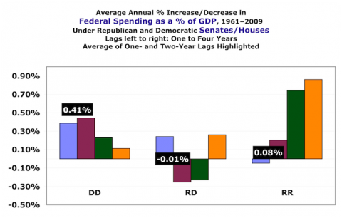
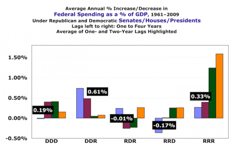
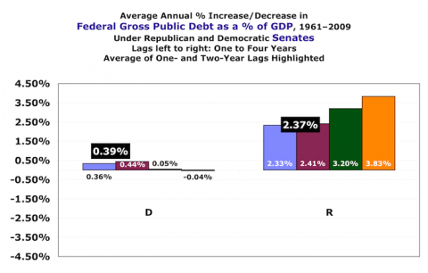
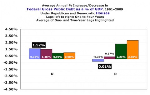
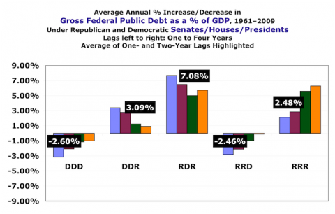
I’ve made the assumption that parties can have a somewhat immediate effect on taxes, spending, and debt. So for those measures I’ve given the average of only the one- and two-year lags. I’ve shown all four bars, though, so you can see the numbers and, if you think it’s useful, eyeball-average them.
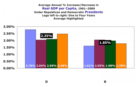
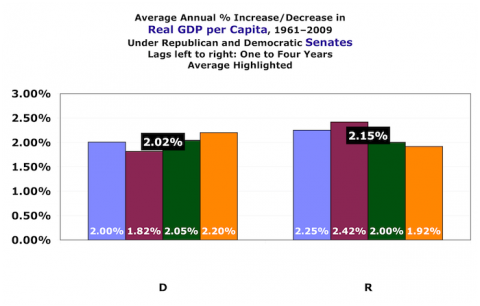
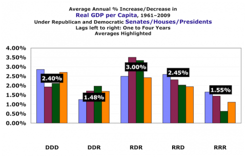
For changes in real GDP per capita — which is a second-order effect and hence (in [my] theory at least) takes longer to appear — I’ve given the average of all four lags. You can produce any other calculations or presentations you want using the spreadsheet.
The highlighted averages are generally in the vertical position indicating their values, except where I’ve had to move them to avoid obscuring information.
That said, here we go.
Taxes
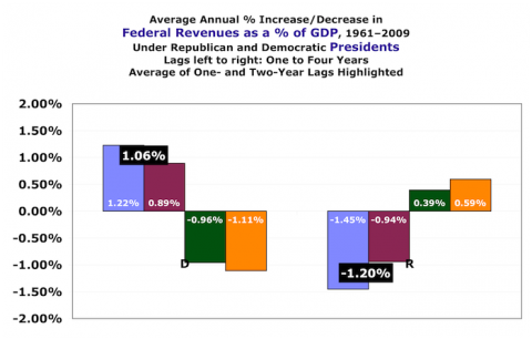
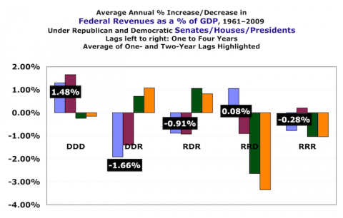
Revenues as a percent of GDP. This means there’s no need to correct for inflation, with the inherent uncertainties of that correction. Short story, everybody cuts taxes except Democratic presidents.
President
Democratic presidents raise taxes. Republican presidents lower them. Alert the media. (This graph shows nicely why I don’t pay much attention to three- and four-year lags for changes in revenues, spending, and debt.)
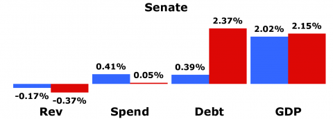
Senate
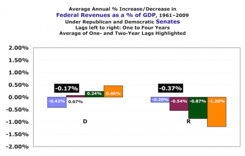
Surprise: Dem senators are tax cutters — just not as much as Pubs. For both parties, the effects are dwarfed by presidential differences.
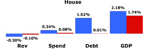
House
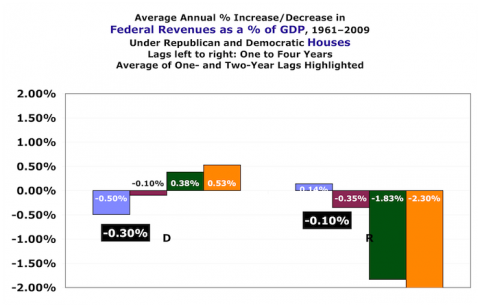
Pretty much the same as the Senate, except that Dem House members cut taxes more than Republicans.
Congress
DDs and RRs are remarkably similar, with small magnitudes.
Combined
The DDD and DDR results are quite similar to the presidential results, above.
Spending
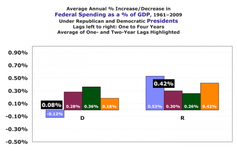
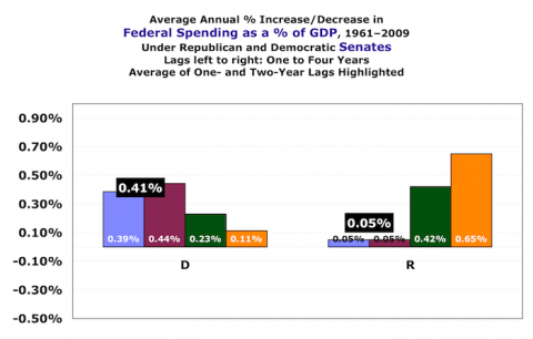
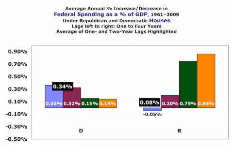
Again, as a percent of GDP so we needn’t correct for inflation. Republican presidents and Democratic senators are the big spenders, followed by Democratic house members. Democratic presidents are as frugal as Republican legislators.
President
Republican presidents raise spending significantly faster than Democrats.
Senate
Dem senators, on the other hand, increase spending something like eight times as fast as Republicans. The data reads darned consistently here, and unlike with taxation, the magnitudes are similar to presidential changes.
House
Almost the same as the Senate: Democrats increase spending faster than Republicans, and with magnitudes similar to the Senate and Presidents.
Congress
Again very similar to the Senate and House. Democrats in Congress increase spending much faster than Republicans.
Combined
DDD vs. DDR basically reflects the presidential differences.
Debt
As a percent of GDP. Somebody might want to add columns to the spreadsheet showing deficit changes, and look at it that way instead.
President
Profoundly large magnitudes and differences here, and remarkably consistent even into the three- and four-year lags.
Senate
Democratic senators, unlike presidents, increase the debt — but nowhere near as fast as Republicans. Smaller magnitudes here than with presidents.
House
Not so the House. Republican congresspeople are more frugal than their Democratic colleagues. Magnitude a bit less than the Senate, far less than presidents.
Congress
DDs and RRs are basically the same.
Combined
DDD versus DDR again mirrors the presidential results.
Real GDP per Capita
This measure is, necessarily, corrected for inflation. Changes in real personal income, a la Bartels, would arguably be a good alternative or additional measure.
President
Lags two and three show the parties in parity. Lags one and four create a Democratic advantage to the tune of .5% extra growth per year.
Senate
Very consistent, and very little difference between the parties. Magnitudes similar to presidents’.
House
Also fairly consistent (though the one-year lag shows party parity) and with similar magnitudes, with the Democrats associated with faster growth.
Congress
Democratic congresses are associated with higher GDP growth than Republicans.
Combined
DDD and DDR again mirror presidential results, though somewhat more pronounced.
Summary
Here’s a summary of all the average changes. (Remember: revenues, spending, and debt changes are averaged over the one- and two-year lags. Real GDP per capita changes are averaged over all four lags.)
Conclusions
Here’s my narrative. You can call it spin, but I hope you’ll at least agree that it’s not contradicted by the facts as they’re analyzed here. Feel free to copy and paste these graphs (credit please), or create your own, and write your own story.
1. On revenues and spending, presidential effects appear to overwhelm congressional effects. This is not surprising when you consider the presidential drives behind Reagan and Bush II’s tax cuts and defense buildups, Johnson’s Great Society plus Vietnam, Clinton’s tax increases, etc.
2. Everyone increases spending (Republican legislators just barely) — Democrats significantly more than Republicans.
3. Only Democratic presidents have the political courage to raise taxes. (Given this, their ability to get elected at all says a lot for their popularity.)
4. Of Republicans, only House members hold the line on debt, due to tiny changes in both revenues and spending.
5. Democratic presidents are the only ones to reduce the debt — and they do so in a big way. (See #3.)
6. Overall, Democratic control is associated with greater growth in real GDP per capita. (In the Senate, Pubs and Dems are essentially the same.) To do the arithmetic for you: if Republican presidents had managed equal increases during their 28 years in power, GDP/capita would be approximately 15% higher than it is today — $53K per person per year, as opposed to $46K.
And if Larry Bartels’ graph is any indication, far more of that (greater) GDP would be flowing through the hands of the middle class.
That’s my story and I’m sticking to it (unless you convince me otherwise).
————————
* You’ll need to know, or learn to use, Excel’s pivot tables — which you should do in any case cause they kick ass. I’ve given brief instructions in the spreadsheet. The graphs require some slightly sophisticated hand-tuning (data sources, label displays, axes, etc.) depending on what you’re trying to show.
** From Unequal Democracy, page 34 (screen grab so I don’t have to type it in):








Comments
11 responses to “Presidents and Congress, Republicans and Democrats: Spending, Taxation, Debt, and GDP”
How do these vary by president? I could easily see Bush data swamping the other Republicans.
@Chris
Take a look at the spreadsheet, you can slice it a lot of different ways or create new ones.
Also check out the links in the first sentence, which lead to yet more links where people have done a lot of that slicing.
I have a methodology question. When it comes to comparing year-to-year percentages, you’ve apparently decided to measure the percent of change OF THE PERCENTAGES, rather than just show the variations of the percentages themselves. This causes more exaggerated movements between years, and I feel it skews your data. For instance, “Debt as a percentage of GDP” is already tracked as a percentage of change (http://www.usgovernmentspending.com/federal_debt_chart.html). From 1981 to 1982, the percentage of change between the two years in this category was 3.19%, yet you decided to calculate the amount of growth between the percentages (1982 percentage divided by 1981 percentage) to reflect a number of 10% growth (incorrectly I might add as the actual percent change of the percentage was 9.1%). This makes gains and losses more than they actually were from year to year. I don’t see the logic in this, and therefore can’t accept the methodology.
I also wanted to point out that I found it curious that you only went as far back as the 2nd term of Harry Truman, when you are able to make party distinctions all the way back to Ulysses Grant. The result of your choice eliminates the spending decisions that were made by FDR during WWII, and thereby exacerbates the difference in spending records between Republican and Democratic presidents as all of the Republican presidents you chose to include had to factor in a significant conflict during their terms, whereas the Democratic presidents did not.
Interesting presentation of data. But I think there are too many extraneous sources of variance _other than_ political/legislative ones, such that this examination of data is not a valid way to evaluate the effectiveness of the various political parties’ financial policies.
Specifically….the performance of the economy, the growth of GDP, the amount of federal revenues, etc., are largely dependent on factors totally independent of politics, laws, etc. Demographic trends such as the age of the workforce, and the number of people contributing to federal entitlement programs v. those taking from them (medicare and SS) are not controlled or effected in any significant way by the existing president or congress.
So, your analysis ends up attributing to presidents or congress changes which are really due, primarily, to things they cannot control.
There is so much attention focused on politics, people forget that the economy is only partly influenced by legislation, taxation rates, etc.
If the economy is analgous to an open fire hydrant, the effects of changing taxation rates by the amounts typical of various presidents or congresses might amount to the addition or subtraction of a small garden hose.
So it’s dangerous to base conclusions about government financial policy on broad economic measures.
There is alot of rhetoric and posturing on both sides, but economic models do in general support supply side theorizing. The debate should not be whether raising taxes contributes positively or negatively to economic growth – most economic models support that, overall, lower taxes have a beneficial effect on economic growth.
The debate should be centered on precisely what we are willing, as a society, to provide in entitlements. The argument that we should “evolve” to a european style “safety net” society is, I believe, seriously flawed. This so called european safety net is an illusion. In Warsaw pact nations where military spending was high, attempts at creating an egalitarian, socialist society failed miserably. In NATO democracies, the safety nets thrived for a while, probably primarily due to the fact that the USA provided 90% of the miltary defense spending needed for our european allies. And today, even without significant defense spending in many european countries, the unfavorable demographics are exposing their so-called safety net as nothing more than a Ponzi scheme.
The US need not go down the same path. President Obama is fond of saying that, as bad as our economy is, it could be worse. Well, as “bad” as some think our national retirement and medical systems are, believe me, they could be much much worse. And if Obama gets his way, as time goes on, they will only decay further.
@86general “Specifically….the performance of the economy, the growth of GDP”
86, I agree — and pointed out — that the GDP part is a second-order effect, and hence is not as directly under the control of elected officials. But if you look at the correlations over a long enough period, and slice them enough different ways — and if all those different analyses point in the same direction — you (I, at least) start to get some real confidence in the resulting conclusions.
Follow some “Related links” from the bottom of this post and others, and you’ll see a lot of those different anlayses of lots of different data sets. Also go to presimetrics.com, and read Larry Bartels (linked at the top of the post), and you’ll see far, far more.
As for revenues, spending, and debt, I disagree with you. Elected officials have a very direct effect on those measures, and when we see consistent and profound differences by party, we should use that information to make judgments about which party delivers what.
Your invocation of communist countries confutes two issues: government owning the means of production, and redistribution. It wasn’t redistribution that brought down communism.
[…] efficient policies that deliver greater equity also deliver greater long-term prosperity. Even the rich get richer under progressive policies (except maybe the very, very rich). The poor and the middle class get far […]
“If the economy is analgous to an open fire hydrant, the effects of changing taxation rates by the amounts typical of various presidents or congresses might amount to the addition or subtraction of a small garden hose.”
And yet the conservative trickle down argument is that taxation rates are more like the wrench on the valve of the hydrant itself. Go figure – reality is probably somewhere between.
your analysis is so flawed it is astounding. Not worth my time to pick it apart. Let me ask a couple of simple questions for you that I know the answer to. Under the Clinton presidency when the there were budget surpluses, who held control in the house and senate? Answer: Republicans. Under Bush II after the first two years who held control of the house and senate? Answer: Democrats. Congress has to pass budget bills and the president signs them, which hasn’t happened in the last three years of a democrat controlled congress (no budget but instead passed a continuing resolution to spend at the previous year’s rate). So to say each president gets the credit or blame for the surpluses or deficits is extremely simple minded to say the least. Nice propaganda piece for people to lazy to do their own research though.
@DMag @DMag As I said, it’s easy to cherry-pick periods and write narratives about them that conform to one’s beliefs. There’s always supporting evidence to be found if the goal is to confirm one’s priors.
See, for instance:
http://www.asymptosis.com/europe-vs-us-who%E2%80%99s-winning.html
Me, I’m always curious to see the best evidence that contradicts my beliefs. How about you?
[…] long-term strategy Democrats could adopt would be somehow convincing Appalachian voters to vote their own (and everyone else’s) economic self-interests. Turn the corner on a dozen or so counties in Indiana, Virginia, and North Carolina (and Florida), […]
[…] long-term strategy Democrats could adopt would be somehow convincing Appalachian voters to vote their own (and everyone else’s) economic self-interests. Turn the corner on a dozen or so counties in Indiana, Virginia, and North Carolina (and Florida), […]